
The Language of Colour: How Paint and Fabric Choices Shape a Room's Mood

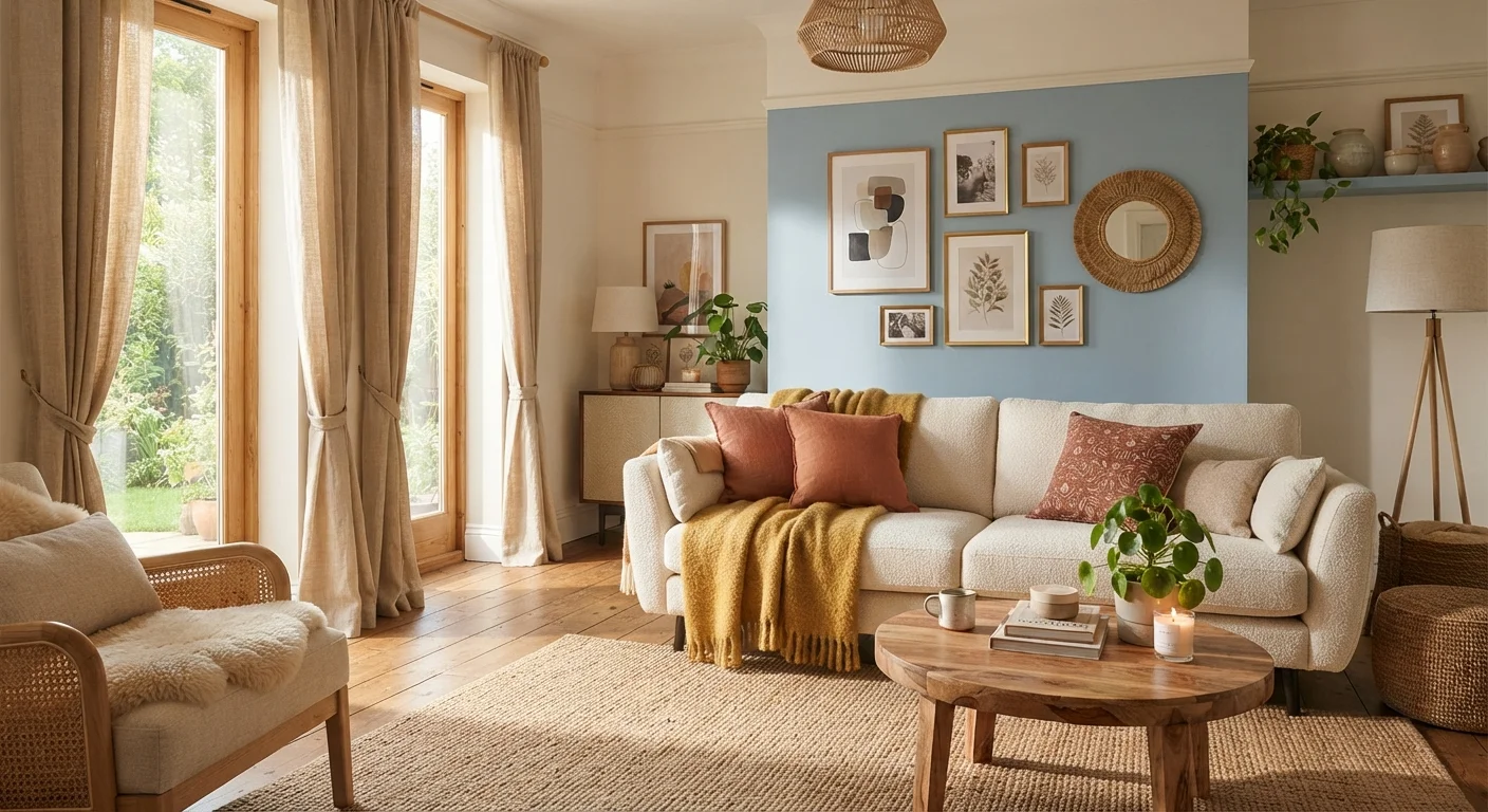
Photo: faqsvault.com editorial
Key Takeaways
- Warm colours like red, orange, and yellow tend to energise a space and make walls feel closer.
- Cool colours like blue, green, and violet generally create calm and can make a room feel more spacious.
- Fabric texture and sheen change how a colour reads — matte fabrics absorb light while shiny ones reflect it.
- Undertones in paint matter as much as the main hue; a 'white' can skew pink, yellow, or grey.
- A 60-30-10 colour split — dominant, secondary, and accent — is a practical framework for balanced rooms.
- Natural and artificial lighting dramatically shift how paint and fabric colours appear throughout the day.
Why Colour Is Never Just Visual
Walk into a room painted deep burgundy and you may feel an almost physical warmth before you notice the furniture. Step into a space washed in pale sage and your shoulders might drop almost involuntarily. These responses aren't accidental — they're the result of how human perception processes colour in combination with light, space, and context.
Interior designers have long used colour deliberately to shape how a room functions emotionally, not just aesthetically. A home office benefits from different colour principles than a nursery. A narrow hallway calls for different thinking than a generous living room. Understanding the basics of colour theory means you don't have to rely on guesswork — or on trends that may not suit your home or your temperament.
For a broader grounding in the terms designers use, the interior decorating terminology glossary is a useful companion reference as you explore these concepts.
Warm vs. Cool: The Foundational Divide
The colour wheel is divided broadly into warm and cool families. Reds, oranges, and yellows are warm — they tend to advance visually, meaning they appear to bring walls closer and give a space an enveloping, energetic quality. Blues, greens, and violets are cool — they recede, making walls seem to step back and contributing to a sense of calm or spaciousness.
This doesn't mean warm colours are only for cosy dens or cool colours only for spa-like bathrooms. Context matters enormously. A warm terracotta in a large, sun-lit kitchen can feel festive and grounded. The same terracotta in a tiny, dark corridor can feel oppressive. A cool sage green in a spacious bedroom reads as serene; in a room with poor light, it can tip toward cold.
90 sec
Time to form an initial impression of a space
Research in consumer psychology suggests people form initial impressions of environments in under 90 seconds, with colour cited as a major contributing factor.
62–90%
Portion of first impressions attributed to colour
Studies in colour research, including work cited by the Institute for Color Research, have suggested colour accounts for a significant share of how environments and products are initially assessed.
3°F
Perceived temperature difference between warm and cool rooms
Environmental psychology research has found that people in rooms painted with warm colours may perceive the temperature as several degrees warmer than in identically heated rooms painted with cool colours.
Yellow deserves a specific mention because it behaves unpredictably. Pure, bright yellows are energising and stimulating — studies in colour psychology frequently associate them with mental activity and alertness, which makes them interesting for creative spaces but potentially fatiguing in areas meant for rest. Muted or ochre yellows are considerably warmer and more versatile, sharing qualities with terracotta and warm neutrals.
The Role of Undertones — and Why White Isn't Simple
One of the most common frustrations homeowners encounter is choosing a paint colour that looks perfect on a chip but wrong on the wall. The culprit is usually undertone — the secondary hue lurking beneath the primary colour. A beige might lean pink, yellow, or green. A grey might skew purple or blue. A white can read as cream, stark, or almost lavender depending on the light hitting it.
The practical solution is to test large swatches — at least 12 inches square — directly on your wall and observe them across different times of day and under your home's actual lighting. What looks neutral in the paint store may read quite differently in your north-facing room. This matters for fabric choices too: a sofa in warm ivory will clash with cool-toned grey walls in ways that aren't obvious until both are in the room together.
For decisions about how paint interacts with other wall treatments, our article on wallpaper vs. paint choices explores how each option affects colour and mood differently.
Fabric and Texture: Where Colour Gets Complicated
Paint sets the stage, but fabric often carries the emotional weight of a room's colour story. Curtains, upholstery, rugs, throws, and cushions together cover substantial surface area and introduce something paint cannot: texture. Texture profoundly changes how a colour reads.
A matte linen fabric in dusty blue absorbs light and appears quieter, more muted — it tends to feel casual and relaxed. The same dusty blue in a silk or velvet will catch light, deepen in the shadows, and feel considerably more formal or luxurious. Neither is better than the other; they serve different moods and room types.
Natural fibre fabrics — linen, cotton, wool — tend to soften colours slightly and bring an organic warmth to a scheme. Our guide to natural materials in the home explores how these materials interact with the overall feel of a space beyond just colour.
Test Fabrics and Paint Chips Together
When building a colour scheme across paint and textiles, consider the 60-30-10 framework: roughly 60% dominant colour (walls, large furniture), 30% secondary colour (curtains, main upholstery), and 10% accent colour (cushions, artwork, small accessories). It's a guideline rather than a rule, but it provides a useful structure for keeping a scheme cohesive without becoming monotonous.
Light Changes Everything
No colour exists independently of its light source — and this is where many decorating decisions go wrong. Natural light from a north-facing window is cooler and bluer than light from a south-facing one, which tends to be warmer and stronger throughout the day. East-facing rooms get warm morning light that fades by afternoon; west-facing rooms do the opposite.
Artificial lighting adds further variables. Incandescent bulbs shift colours warm. LED bulbs range from cool and clinical to warm and amber depending on their colour temperature, measured in Kelvins. A paint that reads as a sophisticated warm grey under daylight may look lavender under cool LEDs or muddy under warm incandescent light.
This relationship between light and colour is explored in depth in our article on lighting as decoration, which explains how fixture choice and placement shape a room's atmosphere alongside — or sometimes more powerfully than — paint and fabric.
Putting It Together: Building a Cohesive Colour Story
Knowing individual colour principles is useful; applying them as a unified scheme is the real skill. A few practical approaches help bridge the gap between theory and execution.
- Start with what you love: A favourite piece of art, a rug, or even a patterned cushion can anchor a palette. Pull two or three colours from it and let them guide your paint and fabric choices.
- Use saturation to create hierarchy: Not every colour in a room needs to be the same intensity. A deeply saturated accent wall pairs well with more muted furniture fabric — this contrast creates visual interest without chaos.
- Repeat colours across surfaces: A shade introduced in curtains gains weight when it reappears in cushions or a throw. Repetition creates the sense that a scheme was intentional rather than assembled by chance.
- Test before committing: Sample pots of paint and fabric swatches placed together in the actual room, observed over several days and under both natural and artificial light, remain the most reliable way to avoid costly surprises.
Colour and style work together — for guidance on combining different decorating approaches within a single space, mixing decorating styles explains how contrast, repetition, and visual weight allow different influences to coexist harmoniously.
Frequently Asked Questions
All published content on this website is for informational and educational purposes only and should not be taken as professional advice. We recommend that readers seek expert opinion before making any decisions. The website is not responsible for any actions taken based on the information provided on this website. We are not liable for any inaccuracies, modifications, or omissions in information. Moreover, external links or third-party content are provided for convenience; we are not liable for their correctness. Users are advised to verify every piece of information before they use it for any purpose.