
Interior Decorating Terminology: A Reference Glossary for the Curious Non-Designer

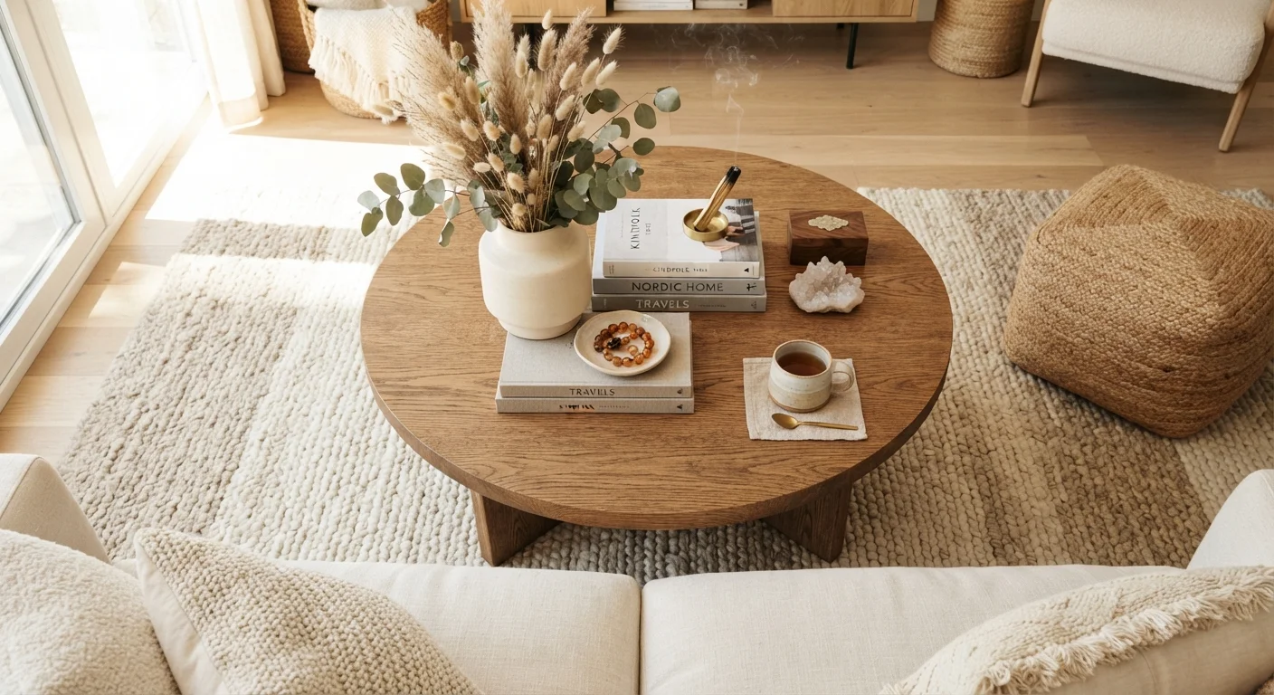
Photo: faqsvault.com editorial
Why Interior Design Has Its Own Language
Walk through any decorating article, design show, or conversation with an interior decorator, and you'll likely encounter a stream of terms that feel like a second language — sightlines, juxtaposition, transitional style. For curious non-designers, this vocabulary can be the difference between feeling inspired and feeling lost.
The good news is that most design terminology describes concepts you've already responded to instinctively in rooms you've loved or hated. Learning the words simply gives you a way to name what you're sensing — and to act on it deliberately. Whether you're refreshing a rental apartment or planning a longer-term home project, this glossary is designed to be a reference you return to, not a one-time read. For a practical companion to these terms, see the First-Timer's Guide to Decorating a New Home.
Design Jargon Doesn't Mean Expensive
Core Concepts: The Building Blocks of Any Room
Before diving into style-specific vocabulary, it helps to understand the structural ideas that apply in almost every decorating context. These are the terms designers reach for when explaining why a room works — or doesn't.
Accent Color
A secondary hue used in small doses to add visual interest to a room. It typically contrasts with the dominant color palette and draws the eye to key elements like throw pillows, artwork, or a single piece of furniture.
Balance
The visual equilibrium of a room, achieved by distributing visual weight evenly. Balance can be symmetrical (mirror-image arrangement), asymmetrical (different objects of equal visual weight), or radial (elements arranged around a central point).
Color Temperature
A description of whether a color reads as warm (reds, oranges, yellows) or cool (blues, greens, purples). Color temperature influences the mood of a space and affects how colors appear under different lighting conditions.
Focal Point
The dominant feature in a room that the eye is drawn to first — such as a fireplace, a large window, or a statement piece of furniture. Effective rooms are typically organized around a clear focal point.
Scale
The size of objects relative to the room or to each other. Good scale means furniture and decor feel proportionate to the space — neither overwhelmingly large nor too small to register visually.
Vignette
A small, intentionally styled grouping of objects — typically on a shelf, table, or mantel — that together create a cohesive and pleasing mini-scene. Vignettes often combine items of varying heights and textures.
Layering
The practice of adding depth to a room by combining multiple textures, patterns, light sources, or decorative elements. Layering prevents a space from feeling flat or one-dimensional.
Undertone
The subtle secondary color visible within a paint or material — for example, a white paint may have a yellow, pink, or blue undertone. Undertones become most apparent when colors are placed next to each other.
Traffic Flow
The natural path people take when moving through a room. Furniture arrangements that respect traffic flow leave clear walkways and prevent a space from feeling obstructed or awkward to navigate.
Negative Space
The intentionally empty or undecorated areas in a room. Far from being wasted space, negative space gives the eye room to rest and prevents a room from feeling cluttered or visually overwhelming.
Ambient Lighting
The general, overall illumination of a room — often from ceiling fixtures, recessed lights, or natural light. It forms the base layer of a lighting scheme, before task or accent lighting is added.
Texture
The surface quality of materials in a room — whether rough, smooth, matte, glossy, soft, or coarse. Mixing textures adds tactile and visual richness, especially in rooms with a limited color palette.
Mastering these foundational ideas will serve you across every design style, from minimalist to maximalist. They're also the concepts most commonly misunderstood when homeowners attempt to troubleshoot a room that feels off but they can't explain why.
Color and Light: Terms You'll Encounter Constantly
Color and light are inseparable in interior design — a color swatch chosen in a hardware store looks completely different under incandescent light, natural north-facing light, or LED strips. Understanding the vocabulary around both helps you make more predictable choices.
| Complementary Colors | Colors directly opposite each other on the color wheel (e.g., blue and orange) |
| 60-30-10 Rule | A common guideline: 60% dominant color, 30% secondary, 10% accent |
| Visual Weight | The sense of heaviness an object projects based on size, color, and texture — not actual mass |
| Biophilic Design | An approach that incorporates natural elements (plants, wood, stone, light) to connect interiors to nature |
| Statement Piece | A single bold or distinctive item intended to anchor the design of a room |
| Warm vs. Cool Neutrals | Beige, cream, and taupe are warm; gray, white, and greige can lean either direction depending on undertone |
One term worth memorizing: color rendering index (CRI), which measures how accurately a light source reveals the true colors of objects in a room. A CRI of 90 or above is generally considered high quality for home interiors. Another is lumen — the measure of total light output from a bulb, as opposed to watts, which measure energy consumption. Choosing bulbs by lumens rather than watts leads to more intentional lighting decisions.
Designers also frequently reference contrast — the degree of difference between light and dark elements in a room. High contrast (think black trim against white walls) creates drama and definition; low contrast produces a softer, more unified feel.
Style and Aesthetic Vocabulary
Style labels are among the most misused terms in decorating — largely because they're defined loosely and used differently across publications and regions. Here's a plain-language breakdown of the most common ones:
- Transitional: A blend of traditional and contemporary elements. Often described as timeless rather than trend-driven.
- Scandinavian (or Scandi): Emphasizes functionality, natural materials, light palettes, and minimal ornamentation. Rooted in Nordic design traditions.
- Bohemian (or Boho): Characterized by layered patterns, global influences, rich textures, and an eclectic, lived-in quality.
- Mid-Century Modern: Draws on American and European design from roughly the 1940s–1960s. Known for clean lines, organic forms, and a mix of natural and manufactured materials.
- Industrial: Incorporates raw or unfinished materials — exposed brick, concrete, metal — often drawing on converted warehouse or loft aesthetics.
- Coastal: Evokes seaside environments through light palettes, natural textures like rattan and linen, and a relaxed, airy atmosphere.
Most well-decorated rooms don't belong exclusively to one style — they borrow intentionally across categories. The design term for this blending is eclectic, which when done well signals personal curation rather than indecision. If you're navigating home investments alongside decorating decisions, the Plain-English Guide to Real Estate Terms can help you understand the property side of the picture.
Furniture and Layout Terms Worth Knowing
Furniture placement decisions are often described using spatial and functional vocabulary that can be confusing the first time you encounter it.
Anchor piece (or anchor furniture): The largest or most visually dominant item in a furniture grouping — typically a sofa or bed — around which other pieces are arranged. Related to this is the concept of a conversation area: a grouping of seating arranged to facilitate face-to-face interaction, typically within eight feet of each other.
Floating furniture refers to pieces pulled away from walls and positioned toward the center of a room to define zones within open-plan spaces. This is often counterintuitive for people accustomed to pushing all furniture against walls, but it can make large rooms feel more intimate and purposeful.
Grounding an arrangement typically involves placing a rug underneath or partially under a furniture grouping. The rug defines the zone visually and creates a sense of cohesion — especially important in open-plan living spaces where one large room serves multiple functions. A common guideline is that at least the front legs of all major seating pieces should sit on the rug.
For anyone tackling home improvement projects alongside decorating, understanding layout terms helps coordinate furniture decisions with structural changes from the start.
Using This Glossary in Practice
Terminology is a tool, not a test. The goal isn't to memorize every word here before you pick up a paint swatch — it's to have a reference you can consult when a term stops you mid-article or mid-conversation. Design vocabulary evolves, and style labels especially shift in meaning across regions and publications. When in doubt, ask what a designer or article means by a specific term in context rather than assuming a universal definition applies.
The most effective decorating decisions tend to come from understanding a small set of foundational principles — scale, balance, layering, light — and applying them consistently, regardless of budget. A room decorated with attention to these principles will generally feel more considered than one assembled around trends without that grounding.
As your confidence grows, you may find it useful to explore how the language of other fields overlaps with home design — from how housing market terminology shapes renovation investment decisions to how a well-kept outdoor space connects to interiors. The Garden & Outdoors hub offers a starting point for anyone thinking beyond four walls.
All published content on this website is for informational and educational purposes only and should not be taken as professional advice. We recommend that readers seek expert opinion before making any decisions. The website is not responsible for any actions taken based on the information provided on this website. We are not liable for any inaccuracies, modifications, or omissions in information. Moreover, external links or third-party content are provided for convenience; we are not liable for their correctness. Users are advised to verify every piece of information before they use it for any purpose.