
Lighting as Decoration: Why Bulbs, Fixtures, and Placement Matter as Much as Furniture

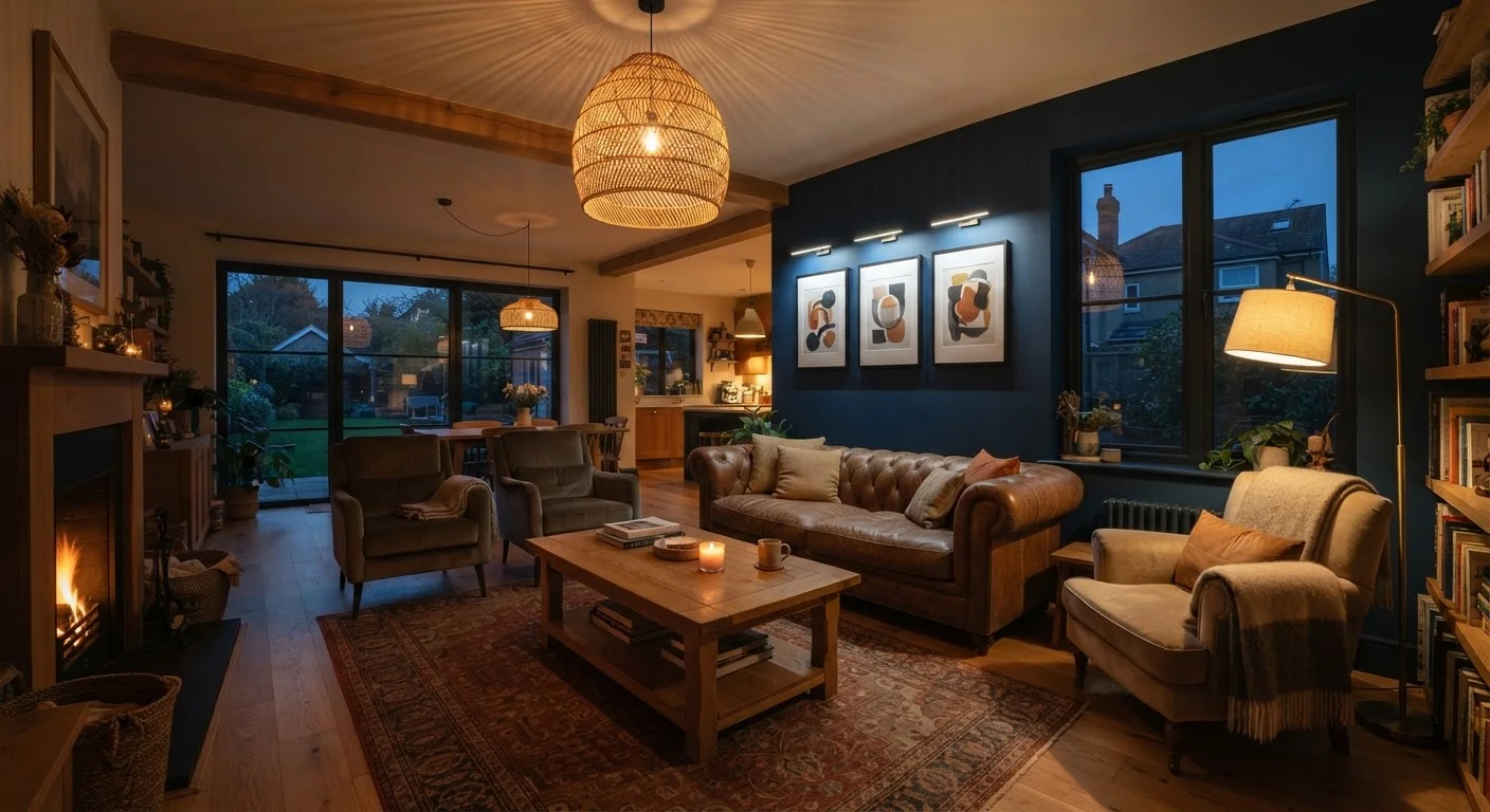
Photo: faqsvault.com editorial
Key Takeaways
- Layering ambient, task, and accent lighting creates depth and flexibility in any room.
- Bulb color temperature — measured in Kelvins — dramatically affects how a room feels.
- Fixtures serve as decorative objects; their scale and style shape a room's visual character.
- Overhead-only lighting is one of the most common and easily fixed decorating mistakes.
- Dimmers are among the most cost-effective upgrades for improving a room's atmosphere.
Why Lighting Is a Decorating Tool, Not Just a Utility
Most people plan a room around furniture, then think about lighting after the fact — if they think about it at all. But lighting is arguably the single most powerful variable in how a space looks and feels. It affects color perception, apparent room size, the warmth of materials, and even the mood of the people in it.
A well-furnished room with poor lighting can feel cold and flat. A modestly furnished room with thoughtful lighting can feel curated and intentional. If you've ever wondered why a hotel lobby feels so different from your living room despite having similar elements, lighting is almost certainly part of the answer.
The good news is that this is one of the most approachable areas of decorating to improve. Whether you're working with a tight budget or planning a fuller renovation, lighting adjustments deliver visible results quickly. As explored in our guide to high-impact, low-cost decorating, lighting often ranks among the most transformative changes per dollar spent.
Understanding the Three Layers of Light
Professional designers consistently talk about layered lighting — the practice of combining three distinct types of light in a single room. Each layer serves a different purpose, and the interplay between them creates depth and visual interest.
90+
Recommended CRI for living spaces
Lighting industry guidance consistently recommends a Color Rendering Index of 90 or above for residential spaces to ensure accurate color representation.
2700K
Warmest standard residential color temperature
Bulbs in the 2700K–3000K range are the most widely recommended for living rooms and bedrooms, closely approximating the warmth of traditional incandescent light.
800
Lumens per 60W-equivalent bulb
A standard 60-watt incandescent bulb equivalent produces approximately 800 lumens — a useful baseline when comparing modern LED replacements.
- Ambient lighting is the base layer — the general illumination that allows you to move through a space safely. It typically comes from ceiling fixtures, recessed lights, or chandeliers.
- Task lighting focuses light where specific activities happen — reading, cooking, applying makeup. Table lamps, under-cabinet lights, and adjustable floor lamps fall into this category.
- Accent lighting is directional and used to highlight specific objects or architectural features — a piece of art, a bookshelf, a textured wall. Picture lights, track lighting, and wall sconces all serve this purpose.
Most rooms rely too heavily on ambient light alone, which creates a flat, institutional feel. Adding even one task lamp and one accent source immediately introduces dimension. Think of it less like illuminating a room and more like composing a photograph — you want highlights, midtones, and shadow all working together.
How Bulb Choice Shapes Color, Mood, and Perception
The bulb inside a fixture matters as much as the fixture itself. The key variable is color temperature, measured in Kelvins (K). Lower Kelvin numbers produce warm, amber-toned light; higher numbers produce cool, blue-white light.
- 2700K–3000K: Warm white — the range most associated with cozy, residential feel. Works well in living rooms and bedrooms.
- 3500K–4000K: Neutral to cool white — common in kitchens and bathrooms where clarity matters.
- 5000K+: Daylight — can feel clinical; useful in workspaces but harsh in relaxation areas.
A second consideration is CRI (Color Rendering Index), which measures how accurately a bulb renders colors compared to natural daylight. A CRI of 90 or above is generally recommended for living spaces — it makes paint colors, fabrics, and skin tones appear as they actually are rather than washed out or shifted.
When in doubt, buy one bulb before committing to a multipack. Test it in the actual fixture and room before purchasing in bulk — bulb color can look very different on store shelving than in your space.
Use a floor lamp directed at the ceiling in a dark corner — it's the fastest, cheapest way to make a room feel larger and warmer without touching the electrical system.
For most living areas, selecting bulbs in the 2700K–3000K range with a CRI of 90+ is a straightforward starting point. Consistency across a room's bulbs also matters — mixing warm and cool sources in the same space often creates visual dissonance without an intentional reason for it. This connects directly to how color choices interact with light, a dynamic covered in our article on how paint and fabric choices shape a room's mood.
Fixtures as Visual Anchors
A light fixture isn't just a delivery mechanism for illumination — it's a piece of furniture for your ceiling or wall. A pendant above a dining table, a sculptural floor lamp in a corner, a row of wall sconces in a hallway — each of these makes a visual statement whether the light is on or off.
Scale is where many people go wrong. An undersized pendant above a large dining table looks tentative; an oversized chandelier in a modest entryway feels overwhelming. A common guideline for pendant sizing over a table: the fixture's diameter in inches should roughly equal the table's width in inches, divided by two — though this is a starting point, not a hard rule.
Style matters too. A fixture's finish, material, and silhouette should feel coherent with the rest of the room's design language — or deliberately contrast with it in a way that reads as intentional. An industrial cage pendant in a room full of organic, natural textures creates tension; a brass sconce in a room with mixed metal tones can feel layered and considered. For more on how contrasting elements can coexist, see our piece on mixing decorating styles cohesively.
Placement Principles That Actually Work
Even the right fixtures with the right bulbs can underperform if placed poorly. A few guiding principles help:
- Avoid centering every source. Overhead fixtures centered in a room often illuminate the middle and leave corners dark. Distributing light sources around the perimeter of a room — through lamps, sconces, or floor lights — creates a more even, lived-in feel.
- Light the vertical plane. Walls and ceilings reflect light back into a room. Uplighting (floor lamps directed upward) or sconces that wash a wall with light dramatically brighten a space without harsh direct illumination.
- Consider what you're highlighting. Accent lighting works best when aimed at something worth seeing — art, an architectural detail, or an interesting material like stone or textured plaster. Randomized accent lighting draws attention to nothing in particular.
- Install dimmers wherever possible. Dimmers are one of the most cost-effective lighting upgrades available. They allow the same fixture to serve multiple functions — bright for tasks, low for ambiance — without additional hardware. Check compatibility with your bulb type before purchasing.
Poor lighting placement is one of the decorating mistakes that quietly undermines otherwise well-designed rooms. Our guide on decorating decisions that make rooms feel off covers this and other common missteps worth knowing.
Common Lighting Mistakes and How to Avoid Them
Several lighting habits are widespread enough to be worth naming directly:
- Relying solely on overhead lighting. A single ceiling fixture as the only light source is the most common mistake in residential spaces. It creates flat, shadowless light that drains a room of warmth.
- Ignoring lumen output. Watts measure energy use, not brightness. Lumens measure brightness. A general guide: a 60-watt incandescent equivalent produces roughly 800 lumens. Match lumen output to the activity — lower for ambient relaxation, higher for tasks.
- Using mismatched color temperatures. One warm-toned lamp and one cool-toned lamp in the same room often creates an uneasy feeling people can't quite name. Consistency in color temperature across a space reads as intentional design.
- Hanging pendants too high. Over dining tables, pendants typically work best when the bottom of the fixture hangs about 30–34 inches above the tabletop — low enough to feel intimate, high enough not to interrupt sightlines.
Room-by-Room Lighting Priorities
Lighting needs vary significantly by room function. Here's a practical breakdown of what to prioritize in each space:
- Living Room
- Layering matters most here. Aim for at least three light sources — an ambient overhead, a task lamp for reading, and at least one accent source. Warm bulbs (2700K) and dimmers are almost always the right call.
- Kitchen
- Task lighting is critical — under-cabinet lighting over countertops makes food prep significantly easier and safer. Overhead lighting in kitchens benefits from being brighter and slightly cooler (3000K–4000K) than in relaxation spaces.
- Bedroom
- Minimize overhead lighting in favor of bedside lamps that can be individually controlled. Warm, low-lumen options support the wind-down process. A dimmable overhead adds flexibility without forcing bright ceiling light at night.
- Bathroom
- Side-lit mirrors (sconces flanking a mirror rather than overhead only) dramatically improve task lighting for grooming by eliminating the unflattering shadows that overhead-only fixtures create.
- Home Office
- Prioritize natural light where possible and supplement with a dedicated task lamp at the correct height to avoid screen glare. A cooler color temperature (3500K–4000K) supports alertness during work hours.
Planning your lighting before committing to furniture arrangements pays dividends. Our room planning checklist walks through exactly this kind of pre-decorating groundwork to help you avoid costly backtracking.
All published content on this website is for informational and educational purposes only and should not be taken as professional advice. We recommend that readers seek expert opinion before making any decisions. The website is not responsible for any actions taken based on the information provided on this website. We are not liable for any inaccuracies, modifications, or omissions in information. Moreover, external links or third-party content are provided for convenience; we are not liable for their correctness. Users are advised to verify every piece of information before they use it for any purpose.